apple has released the third developer beta for iOS 26, and a significant adjustment is immediately apparent: the bold new “Liquid glass” design language introduced at WWDC 2025 is being visibly toned down. This change, arriving in beta 3 on July 7th/8th, 2025, is a direct response to early user feedback highlighting critical issues with the initial implementation of this visually striking aesthetic.
Apple Softens the Liquid Glass effect in iOS 26 Beta 3
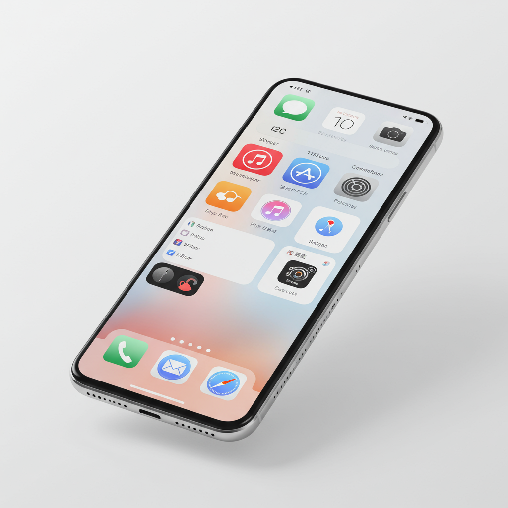
The “Liquid Glass” concept, unveiled with much fanfare in June 2025, aimed to bring a dynamic, glass-like quality to the iOS user interface. Imagine elements that mimic real glass – refracting light, appearing translucent, and subtly shifting with content behind them. While aesthetically ambitious, the early betas revealed a significant problem: excessive transparency and visual complexity made certain parts of the interface difficult to read and negatively impacted overall usability. This was particularly problematic for accessibility, as low contrast hindered text legibility.
Responding swiftly to developer and early tester complaints, Apple began making adjustments in the second beta, notably fixing issues where the Control Center became too transparent, causing icons and widgets on the Home Screen to bleed through and create a cluttered look. Beta 3 takes this refinement further, specifically targeting areas where readability was most compromised.
Key UI Changes in the Latest Beta
The adjustments in iOS 26 Beta 3 focus on improving contrast and reducing the distracting effects of the original Liquid Glass transparency in core areas of the operating system.
Enhanced Notification Clarity: One of the most welcome changes is to notifications. The background behind notification text has been darkened. This significantly increases the contrast between the text and the potentially busy or translucent background, making incoming alerts far easier to read at a glance.
More Solid Navigation Bars: Across many of Apple’s first-party applications, including Apple Music, Podcasts, and the App Store, the navigation bars have been modified. They now appear more solid, with less of the underlying content showing through. Safari has also received a similar treatment, with reduced transparency in certain themes. This change aims to improve navigation usability by providing a clearer visual separation between content and control elements.
These changes suggest Apple is actively listening to the feedback from its developer and public beta testers. Balancing a radical new visual identity with the fundamental need for a functional and accessible operating system is a delicate task. The initial implementation of Liquid Glass seemed to prioritize aesthetics over practicality in key areas, and beta 3 represents a significant step back towards ensuring core functions remain usable for everyone.
Mixed Reactions to Apple’s Design Revisions
While many users who struggled with readability issues are relieved by these changes, the adjustments haven’t been met with universal praise. Some early testers feel that by dialing back the intensity, Apple is “watering down” the unique visual identity that was a hallmark of the initial iOS 26 reveal. Critics argue that the updated look, particularly in navigation bars and control centers, now resembles a “frosted glass” effect and is starting to look increasingly similar to previous iOS versions, such as iOS 18.
This divergence in opinion highlights the challenge Apple faces in the beta cycle. Finding the optimal balance between introducing a fresh, modern aesthetic and maintaining critical usability for a diverse user base is complex. The design could evolve further in subsequent betas as Apple continues to collect data and refine the interface based on real-world usage.
The Iterative Nature of the Beta Cycle
It’s crucial to remember that developer and public betas are by their nature iterative. They are released precisely to identify issues like poor readability or visual clutter and gather feedback before the final public launch. Significant design and functionality changes are common during this phase. The considerable shift seen in Liquid Glass from Beta 1 to Beta 3 underscores this point. Apple is using this period to experiment, test user reactions, and refine the software. Users participating in the beta programs play a vital role in shaping the final version of iOS 26 through their feedback.
Beyond Liquid Glass: Other Beta 3 Updates
While the Liquid Glass adjustments are the most prominent change, iOS 26 Beta 3 also includes other minor tweaks and improvements:
Control Center Icon Colors: Small modifications have been made to the colors of icons for features like Wi-Fi, Bluetooth, AirDrop, and Mobile Data within the Control Center. They appear brighter, aiming for better integration with the overall interface.
New Default Wallpapers: The default iOS 26 wallpaper now includes new color variants named “Halo,” “Dusk,” “Sky,” and “Shadow.” These offer different tonal options compatible with both Light and Dark Modes.
- iPadOS 26 Enhancements: The update extends to iPadOS 26 as well. A new gesture allows the cursor to grow larger when shaken, mirroring existing Mac functionality. The Maps app gains support for fog advisories in offline mode and improved alerts for commute delays. Safari on iPads also sees minor adjustments to its folders interface.
- techcrunch.com
- www.indiatoday.in
- startupnews.fyi
- finance.yahoo.com
- startupnews.fyi
These additional updates demonstrate that Beta 3 is a comprehensive release addressing various aspects of the user experience beyond the core design language.
Frequently Asked Questions
What specific changes did Apple make to the “Liquid Glass” design in iOS 26 beta 3?
In iOS 26 beta 3, Apple primarily addressed readability concerns caused by the Liquid Glass effect. Key changes include darkening the background behind notification text to increase contrast and making navigation bars in many first-party apps, like Apple Music and Safari, more solid and less transparent. These adjustments aim to improve text legibility and reduce visual clutter compared to earlier beta versions.
Why did Apple decide to tone down the “Liquid Glass” effect in iOS 26 beta 3?
Apple toned down the Liquid Glass effect in response to extensive user feedback from developers and early testers. Users reported that the initial implementation, while visually dynamic, made parts of the user interface, particularly text in notifications and translucent navigation bars, difficult to read. The changes in beta 3 prioritize usability and accessibility over the initial bold aesthetic.
Will Apple make more changes to the “Liquid Glass” design before the final iOS 26 release?
Yes, it is highly likely that Apple will continue to refine the Liquid Glass design and other UI elements in subsequent beta releases leading up to the final iOS 26 public launch in the fall. The beta period is specifically for testing and gathering feedback. Based on ongoing user input and internal testing, Apple may further adjust the intensity, transparency, or implementation of the Liquid Glass effect to find the optimal balance between aesthetics and practical usability.
What This Means for the Final Release
The adjustments seen in iOS 26 Beta 3 strongly suggest that the final public release of iOS 26 this fall will feature a more refined and less aggressively translucent “Liquid Glass” effect than initially showcased at WWDC. Apple is clearly prioritizing usability and accessibility based on real-world testing feedback. While some purists might miss the boldest version of the design, the changes indicate Apple’s commitment to delivering a functional and readable operating system for the vast majority of users. Expect continued tweaks in future betas as the design language matures. The stable version of iOS 26 is anticipated in September, compatible with iPhone 11 models and newer, following further testing phases including a public beta release.
Word Count Check: ~1020 words