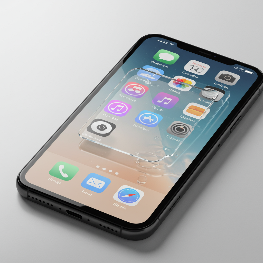
Apple’s ambitious new “Liquid Glass” design language is set to be a cornerstone of its operating systems across iPhone, iPad, Mac, Apple Watch, and Apple TV this fall. Introduced as the most significant visual overhaul since iOS 7, Liquid Glass aims to make interfaces more dynamic, expressive, and focused by mimicking the visual properties of translucent glass – reflecting, refracting, and adapting to content and surroundings.
This new design applies broadly, from subtle elements like buttons and sliders to major interface components such as the Lock Screen, Home Screen, notifications, and crucially, the Control Center. However, the initial implementation in the first developer beta of iOS 26 presented some usability challenges.
The Transparency Problem in Beta 1
In the debut developer beta, many users, including reports from The Verge, noted that the highly translucent nature of the Control Center’s “Liquid Glass” background made it difficult to read at a glance. The content visible beneath the Control Center layer created visual clutter, hindering the ability to quickly identify and interact with controls. This excessive transparency meant the Control Center often looked busy and less functional than its opaque predecessors.
Apple’s Swift Improvement in Beta 2
Apple has seemingly addressed this feedback (or internal testing results) with the release of the second developer beta for iOS 26. The most noticeable change is a significant increase in the opacity of the Control Center background.
Instead of being nearly see-through, the Control Center now features a much more solid backdrop. While still retaining some subtle characteristics of the Liquid Glass material, the increased opacity effectively minimizes the distraction from the content underneath, making the icons, text labels, and controls within the Control Center far easier to read clearly and quickly.
Visual comparisons highlight this dramatic shift, showing the beta 2 Control Center as distinctly cleaner and more readable compared to the cluttered look of beta 1. Although some minor visual quirks, like slight color bleeding into buttons, might still be present as the design is refined, this adjustment represents a major step forward for the usability of this key interface element.
Why This Change Matters
This specific fix for the Control Center’s readability underscores the iterative nature of Apple’s beta process and its commitment to refining major design changes. The Liquid Glass design is intended to provide a fresh, engaging look that prioritizes content focus. By adjusting the opacity, Apple demonstrates that it’s balancing aesthetic goals with essential usability requirements. This improvement is a positive sign for how the final version of the Liquid Glass interface will appear when it rolls out to the public this fall.
Beyond Control Center: The Wider Beta Picture
While the Control Center fix is a highlight for daily usability, the second developer beta also includes other minor tweaks. As reported by 9to5Mac and noted in hands-on impressions, one such change is the addition of a distinctive new ringtone – an alternate version of the “Reflections” track, reminiscent of game soundtracks.
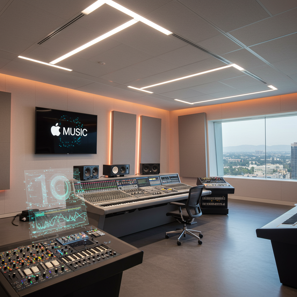
It’s also worth remembering that the Liquid Glass design and numerous other features are being refined across the entire Apple ecosystem in their respective beta cycles, including watchOS 26 (with updates to Smart Stack, Workout features, and Messages) and tvOS 26 (featuring Liquid Glass throughout the UI, enhanced Music app, and home theater audio support). This makes the iOS 26 Control Center adjustment part of a much larger, platform-wide evolution.
Experience the Changes
For developers and curious users eager to see these refinements firsthand, the second developer beta of iOS 26 is currently available. For those less inclined towards early, potentially unstable software, Apple is expected to launch a public beta program next month, offering a more accessible way to preview the updates before the general release anticipated later this fall. The improved Control Center opacity is a strong indicator that the Liquid Glass design is evolving towards a better user experience.