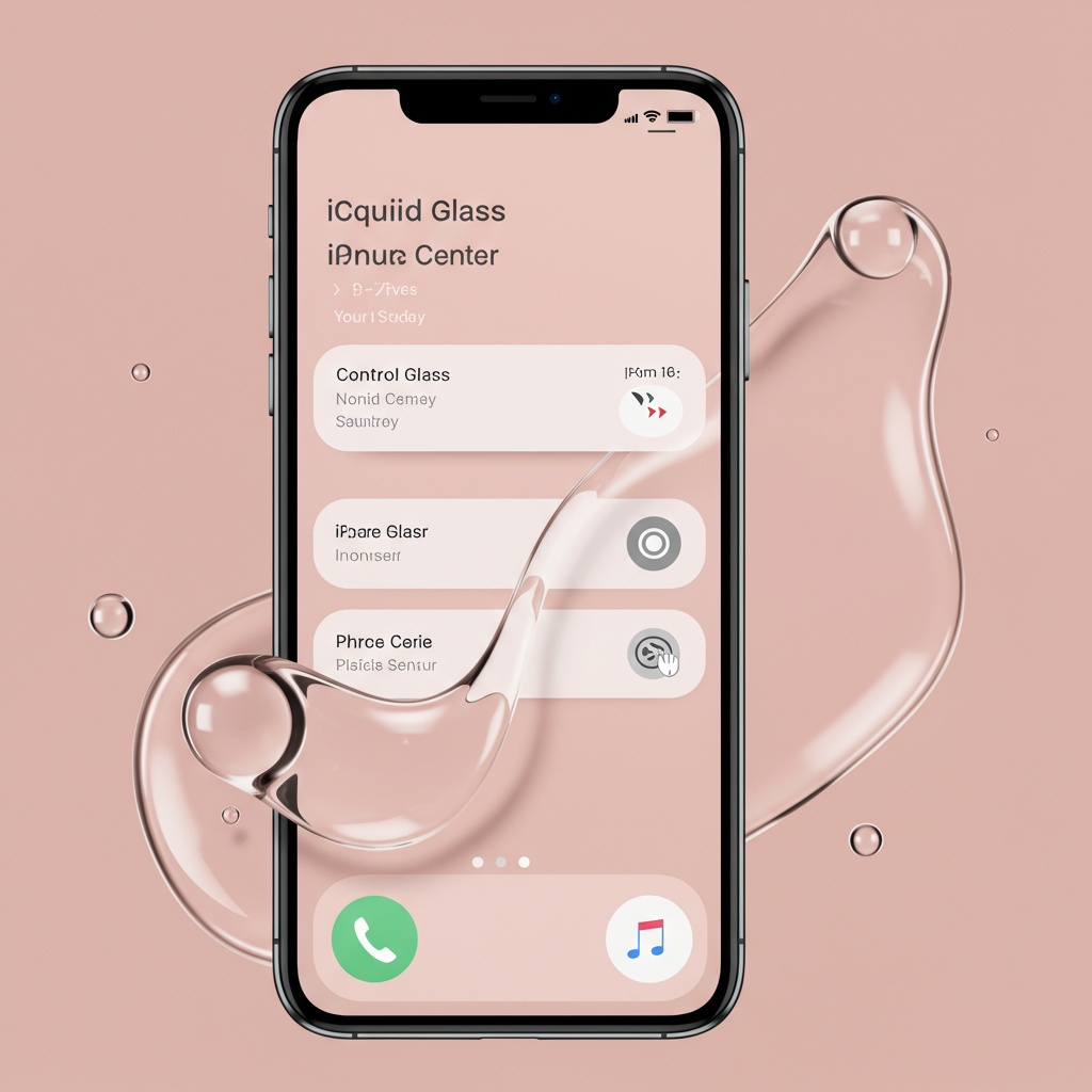
Apple has just released the second developer beta of iOS 26, and it brings crucial refinements to the operating system’s new, highly discussed user interface: Liquid Glass. Announced earlier this month at WWDC 2025, Liquid Glass introduces a modernized look and feel inspired by the optical properties of glass, featuring translucent menus, glossy icons, and rounded controls intended to create a dynamic and fluid aesthetic across Apple devices like the iPhone and iPad. This major redesign is considered by some to be the most significant since iOS 7 and is part of Apple’s new strategy to unify design language across its platforms, including macOS Tahoe and iPadOS 26.
However, the initial developer beta of iOS 26 drew criticism from early testers. Despite the system elements being designed to adjust light and dark in real-time, users quickly pointed out significant issues with readability and usability in certain areas of the Liquid Glass design. Screenshots shared on social media highlighted instances where the visual style made interface elements difficult to discern.
Addressing Control Center Readability
One of the most prominent concerns centered around the Control Center. In the first beta, its semi-transparent nature meant that the icons and widgets on the Home Screen visible beneath the overlay showed through excessively. This made it challenging to differentiate the Control Center’s own buttons and sliders, leading to complaints that it was nearly unreadable, especially against busy or light-colored wallpapers.
With the release of iOS 26 Beta 2, Apple has directly addressed this feedback. The update features a noticeable adjustment to the background blur behind the Control Center. The effect is now darker and stronger, making the underlying Home Screen content significantly more obscured. This stronger visual separation causes the Control Center elements to “pop much more clearly,” dramatically improving both its readability and overall usability. While it’s debated whether this was a direct reaction to public beta 1 feedback or a pre-planned refinement, the result is a Control Center that is undoubtedly more functional.
Other UI Tweaks and Improvements
Readability issues were also noted with notifications in the first beta. Beta 2 shows some improvement here, making notifications a bit sharper. However, developers note that further work is still needed, particularly to ensure notifications are easily readable against brighter or lighter backgrounds.
These adjustments in Beta 2 signal that Apple is actively listening to early developer and tester feedback and refining the Liquid Glass interface ahead of its public launch. While these changes are likely not the final versions before the operating system’s public release in the fall, they demonstrate Apple’s commitment to polishing the user experience. Some users have also expressed a desire for more customization options within the Liquid Glass interface, such as manual control over blur and transparency levels, and the ability to customize the Control Center layout itself, pushing back against a “one-size-fits-all” approach.
Beyond the Interface: Other Beta 2 Features
Alongside the crucial Liquid Glass refinements, iOS 26 Beta 2 introduces several other new features and changes:
An Accessibility section has been added to App Store product pages.
iCloud sync is now enabled for the Journaling app on iPads.
Order tracking features have been introduced within Apple Wallet.
New Apple Music widgets are available, including a Live Radio widget useful for CarPlay and a Search widget for quick access from the Lock Screen.
Previously hidden iPhone wallpaper collections unique to specific models have returned, now featuring a parallax effect for the primary iOS 26 wallpaper.
A previously hidden ‘Alt 1’ ringtone is now visible.
Message notifications from unknown senders now display a blue badge for easier visual distinction.
Requests made using integrated ChatGPT functionalities are now labeled.
The Safari “More” menu (the three dots) has received a new layout with updated icons and order.
The High Contrast Mode accessibility feature now adds visible borders around Liquid Glass elements.
- Icon alignment in the Dock has changed, now left-aligned when fewer than four applications are present.
- techcrunch.com
- wccftech.com
- timesofindia.indiatimes.com
- 9to5mac.com
- www.tomsguide.com
These ongoing beta releases for iOS 26, iPadOS 26, and macOS Tahoe 26 provide developers with early access to test and provide input on the significant visual and functional changes coming to Apple’s platforms. A public beta is expected in the coming month, allowing a wider audience to experience the evolution of the Liquid Glass interface and other new features before the final public release later this year.