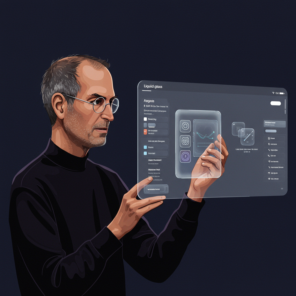
Apple’s Liquid Glass UI: Would Steve Jobs Find it Fun?
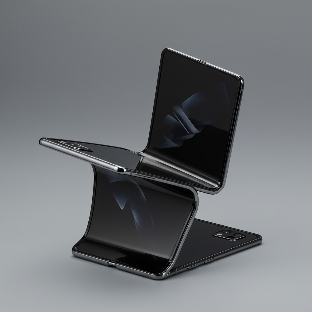
Apple’s recent Worldwide Developers Conference (WWDC 2025) introduced a sweeping software redesign dubbed “Liquid Glass.” Positioned by Apple as its “broadest software design update ever,” this new aesthetic aims to bring a fresh look and feel across iOS 26, macOS Tahoe 26, and other platforms, featuring translucent, layered elements designed to mimic glass and dynamically adapt to content.
According to Apple executives, Liquid Glass is intended to be “Expressive. Delightful,” adding “depth, vibrancy, and a new level of expression” while keeping “content in focus.” The goal is to make interface elements like icons, widgets, and menus reflect and refract surroundings, seamlessly blending into both light and dark environments.
However, this significant visual shift has sparked considerable debate and criticism online. While some early users appreciate the aesthetic, particularly a “clear mode” that enhances translucency, many others have raised concerns that the design prioritizes flashy looks over fundamental usability. This reaction prompts a familiar question often asked when Apple makes big changes: What would Steve Jobs think?
Steve Jobs’ Vision: Design as Delight
Recalling Steve Jobs’ keynotes offers insight into his design philosophy. Beyond the revolutionary products, Jobs often emphasized the feeling a product evoked. Who can forget his famous iPhone introduction, pausing a demo to playfully prank call a Starbucks for 4,000 lattes? It was unexpected, human, and injected fun into technology.
Another defining moment came in 2000 with the introduction of Mac OS X’s Aqua interface. With its fluid gradients, transparency, and glossy, almost reflective appearance, Aqua was unlike anything else at the time. When Jobs unveiled it, he famously described a core design goal: “One of the design goals was that when you saw it, you wanted to lick it.” He wasn’t just talking about aesthetics; he was talking about creating a powerful emotional connection, a sense of tactile desire for a digital interface. Design, for Jobs, had to be useful, but crucially, it also had to be delightful.
The Liquid Glass Reality: Aesthetics vs. Usability?
Comparing the “lickable” Aqua to the new Liquid Glass, some critics feel something is missing. Despite Apple’s description of Liquid Glass as “delightful,” the initial reveal and beta previews have led to accusations of the design being strangely sterile or even a “smeary mess.”
Much of the online discussion points to potential practical problems. Concerns include:
Readability Issues: Translucent notifications and elements can make text harder to read, especially when layered over complex backgrounds or images.
Visual Clutter: The dynamic reflection and refraction, combined with overlapping translucent elements, can create confusing visual noise.
Accessibility Concerns: The increased transparency and potentially lower contrast in certain modes might pose difficulties for users with visual impairments.
Prioritizing Form Over Function: Critics argue the aesthetic appeal outweighs the importance of clear, functional design, referencing Jobs’ quote that “design was how it works, not how it looks.”
Specific examples causing controversy include the appearance of the Control Center in a highly translucent state, described by some as “undeniably awkward.” While the design aims for consistency across the Apple ecosystem, translating the layered, spatial aesthetic of visionOS (where it makes sense for augmented reality) to flat screens has proved challenging for some users.
A Pendulum Swing in Design History
The focus on transparency in Liquid Glass isn’t entirely new. Design trends are often cyclical; we’ve seen similar translucent effects before, notably in Microsoft’s Aero design introduced with Windows Vista and 7.
Apple itself has swung between design philosophies. The early days (pre-iOS 7) featured skeuomorphism, mimicking real-world textures and objects (like a notepad app looking like actual paper) to make digital interfaces intuitive. This was largely stripped away under Jony Ive’s leadership, shifting to a much flatter, more minimalist design with iOS 7 in 2013. Liquid Glass, with its return to depth, transparency, and dynamic effects, represents another swing of this pendulum, perhaps even a subtle rejection of the purely flat aesthetic.
However, the current critique is that unlike the purposeful skeuomorphism (designed for ease of use in a new mobile world) or the clean break of flat design, Liquid Glass feels less like a fundamental improvement in how things work and more like an aesthetic overlay.
The Beta Factor and External Pressures
It’s important to remember that Liquid Glass is currently in developer beta. Design elements and execution are subject to change before the public release later this year. Addressing usability feedback is precisely the purpose of a beta phase, and Apple is known for refining its software before launch.
Furthermore, Apple is under considerable pressure, particularly regarding its long-awaited advancements in artificial intelligence, branded “Apple Intelligence.” While the Foundation Models API was arguably the most significant technical announcement at WWDC 2025, the visual redesign was meant to be the delightful showcase. Perhaps the focus on delivering on complex AI promises overshadowed the creative energy needed to make the design truly shine, leading to a perception of the keynote itself being somewhat of a “yawner” compared to Jobs’ era.
The Enduring Question
So, would Steve Jobs have approved of Liquid Glass? The original author suggests Jobs wouldn’t necessarily “roll over in his grave,” acknowledging it’s still an early beta. But the core point remains: Jobs would have demanded more fun, more delight, more emotion from the design. He wouldn’t just explain the technical properties of refracting light; he would have found a way to make people feel something about it, to want to touch it, or yes, even lick it.
While Apple doesn’t need to replicate Jobs’ unique showmanship, critics feel it needs to recapture that spirit where design isn’t just functional or even beautiful – it’s captivating, memorable, and genuinely delightful. Until Liquid Glass evokes a stronger, more positive emotional response that doesn’t compromise usability, the question of whether it lives up to the Jobsian standard of design as a source of joy will linger.