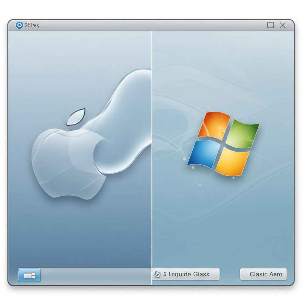
Apple’s latest user interface refresh, dubbed “Liquid Glass,” is sparking significant debate, not least because of its striking resemblance to a past design language: Windows Vista’s much-maligned “Windows Aero.” Unveiled at WWDC 2025 for upcoming operating systems like iOS 26, macOS Tahoe 26, and iPadOS 26, Liquid Glass brings back widespread transparency and glass-like effects, prompting many to ask: is this a successful evolution, or just a polished retread of a design misstep?
A Familiar Reflection: Echoes of Windows Vista Aero
It’s hard to miss the visual parallels between Apple’s Liquid Glass and Microsoft’s Windows Aero, which defined the look of Vista and early Windows 7. Both lean heavily on translucency and depth. In Liquid Glass, you see it in the “glassified” appearance of app icons, reminiscent of Vista’s glossy look, and in the transparent backgrounds of menus and windows, echoing Vista’s transparent window borders. The core idea in both designs is to use visual depth and transparency to help users orient themselves and access information.
However, proponents argue that Apple is succeeding where Microsoft stumbled. Vista’s Aero UI, while visually interesting, was hampered by the operating system itself. Vista was notoriously slow, buggy, and resource-intensive, making the graphically demanding Aero a burden for many computers in 2007. Enabling Aero required a powerful GPU, a rarity back then.
Fast forward to today: modern hardware, particularly Apple’s own efficient silicon, means that even integrated graphics can handle complex UI elements and transparencies with ease. This foundational hardware advantage allows Apple to implement Liquid Glass without the performance penalties that plagued Vista. Furthermore, Apple’s shift towards Liquid Glass is less of a jarring leap than Vista was from Windows XP. Apple has been gradually incorporating transparencies and moving away from strict skeuomorphism since iOS 7 in 2013, and even earlier with the glossy dock in Mac OS X. This evolution means the underlying interface remains largely familiar to users.
Origin Story: From AR to Desktops
Adding another layer to the story, Apple’s Liquid Glass design language didn’t originate with iPhones or Macs. It was born out of visionOS, the operating system for the Apple Vision Pro headset. visionOS required a design that could layer digital information over the real world without completely obstructing the user’s view, necessitating translucent, layered elements.
Apple software leadership indicates the move to bring this look to its broader ecosystem is driven by the increasing interconnectedness of devices. The goal is to create a unified, consistent user experience across iPhone, Mac, iPad, and Apple Watch, ensuring UI elements feel familiar regardless of the device. Apple views this as a “broadest” design update, emphasizing its universality across platforms.
The Counter-Argument: Is it a Flawed Imitation?
Despite the rationale and hardware improvements, Liquid Glass isn’t winning everyone over. Critics argue that applying a design language developed for an AR/VR headset to standard 2D screens simply doesn’t translate well. On flat displays, elements like transparent menus or glowing icons can appear less like integrated objects in space and more like “hokey 3D effects” or “virtual bubbles,” potentially adding distracting visual noise.
A major concern raised by some is the potential impact on usability and accessibility. While Apple claims Liquid Glass keeps content in focus, some reviewers find the excessive translucency creates a significant lack of contrast. This makes text and interface elements difficult to read against varying backgrounds, a problem that could particularly affect users with visual impairments or learning disabilities like dyslexia. This stands in contrast to Windows Aero, which some argue had a stronger, more effective blur that maintained better legibility.
Furthermore, some see Liquid Glass as a step backward, a final rejection of the cleaner, flatter design philosophy introduced with iOS 7 by Jony Ive. They view design trends as cyclical, and the return to transparency, rounded corners, and 3D effects feels like revisiting a past era, not necessarily for the better. The “all clear” icon style, draining color for a glassy look, while stylish, has also been questioned for potentially hindering users’ ability to quickly identify apps.
Examples like the iOS 26 Control Center have drawn specific criticism, where its transparency can feel “overbearing” when layered on the home screen, creating multiple levels of glassy windows. While the revamped Safari’s transparent location bar is praised for enabling full-screen browsing, other implementations raise questions about practicality.
A Polarizing Vision, Still in Progress
Like many significant interface redesigns, Liquid Glass is proving polarizing. Some users and reviewers, including the original author of this piece, find the aesthetic appealing, describing icons as “tiny jewels” and the transparency as adding a much-needed dose of personality, perhaps even hinting at future holographic interfaces. Others, including some colleagues, find it “busy and obnoxious,” feeling firmly “rooted in the mid ’00s.”
Fortunately, for those who dislike the new look, Apple typically includes Accessibility settings that allow users to reduce transparency effects and motion, offering some level of customization.
It’s also important to remember that these operating systems are still in developer beta. Apple has time before the public release this fall to tweak the design based on feedback. Concerns about the Control Center’s transparency or overall legibility might lead to refinements. Apple’s history suggests they will likely fine-tune elements, perhaps “quietly” addressing complaints without acknowledging initial missteps, as seen with the adjustments made after the initial iOS 7 launch. The debate between pushing aesthetic boundaries versus prioritizing functional simplicity and legibility continues.
Ultimately, whether Apple’s Liquid Glass is truly Windows Vista’s Aero “done well,” a flawed imitation, or simply a natural evolution enabled by modern tech, will depend on how the final version performs and how millions of users respond to having transparency back at the forefront of their daily digital interactions.