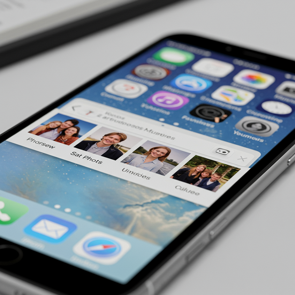
The photos app stands as a cornerstone of the iPhone experience, serving as the central hub for your most cherished visual memories. It’s where every snapshot and video lives, offering tools to not just store but also organize, discover, and enhance your media library. Given its essential role, any alteration to the Photos app carries significant weight for iPhone users, even if the changes appear subtle initially. With the advent of iOS 26, Apple has introduced several refinements to Photos that promise to elevate its usability and correct some perceived missteps from the previous iOS 18 iteration. This deep dive explores the key differences between Photos in iOS 26 and iOS 18, revealing why these seemingly minor adjustments can have a major impact on your daily iPhone interactions.
A Tale of Two Interfaces: iOS 18’s Unified vs. iOS 26’s Refined Layout
One of the most immediate and impactful changes users will notice in Photos under iOS 26 is a significant shift in how content is presented upon opening the app. iOS 18 attempted a bold new direction, consolidating the traditional Library, For You, Albums, and Search sections into a singular, unified screen. This design placed the main photo grid in the upper half of the display, while collections and albums resided in the lower half. The idea was to make everything accessible via vertical scrolling.
However, in practice, this unified approach in iOS 18 led to excessive scrolling and felt less intuitive for many users seeking specific sections. It complicated navigation by burying frequently accessed areas like Albums and Search within a long, continuous feed.
Recognizing this user feedback, iOS 26 introduces a thoughtful course correction. Apple hasn’t reverted to the multi-tab structure of older iOS versions entirely, but it has clearly divided the app into two primary, distinct sections: Library and Collections. Upon launching Photos in iOS 26, you are greeted directly by your photo Library grid. A small, ever-present tab switcher is now located at the bottom of the screen, offering easy access to “Library,” “Collections,” and a dedicated “Search” icon. This simple division makes navigating between your entire photo dump and your curated or automatically generated groupings far more straightforward and less overwhelming than the iOS 18 design. It’s a small change in design philosophy but one that dramatically simplifies the app’s core navigation.
Furthermore, iOS 26 incorporates Apple’s new “Liquid Glass” design language across the system. While its effect is perhaps less pronounced in Photos compared to other apps like Safari, due to Photos’ already minimal interface, you can observe subtle transparency and blurring effects applied to overlaying elements. This design aims to visually push UI elements to the background, keeping your content front and center, a theme echoed in other iOS 26 app updates.
The Library View: Subtle Shifts for Better Access
The core Library experience – scrolling through your photos in a grid – remains largely consistent between iOS 18 and iOS 26. Both versions allow vertical scrolling, pinch-to-zoom for adjusting grid size, and provide “All,” “Years,” and “Months” options at the bottom to quickly group photos by time period. However, the placement of essential controls within the Library view sees notable improvements in iOS 26.
In iOS 18, the Library screen placed icons for Search, Select (for batch actions), and user profile information in the top right corner. Sorting and view options were located at the bottom right, alongside an ‘X’ button to exit the split view arrangement. This scattered layout often required users to reach to different parts of the screen to perform common actions like searching or sorting.
iOS 26 streamlines these interactions within the Library. The top right corner retains the “Select” button, but it is now joined by the sorting/view options button, which features a new, clearer icon. Crucially, the Search icon has been relocated to the bottom right corner, within easy thumb reach. The “Years,” “Months,” and “All” options at the bottom also expand slightly to fill the space more effectively. A new button in the bottom left of the Library view provides a quick toggle to switch directly to the Collections tab, removing the need to navigate via a more complex menu. While the user profile button is no longer in the Library, it has a consistent home in the Collections section. This reorganization in iOS 26, particularly moving search to the bottom, makes interacting with your vast photo library more ergonomic and efficient. Searching for specific images becomes a quicker, more fluid action.
Tapping the search icon in both versions brings up the search interface, which is visually updated in iOS 26 with the Liquid Glass style, though the layout and underlying functionality for searching by keywords, people, places, etc., remain the same. Interestingly, the iOS 18 search page featured a transparent background, a visual element oddly absent in the iOS 26 version. Similarly, filtering options (e.g., show only favorites, edited, not in albums) and general view options are functionally identical across both updates, ensuring users retain the same granular control over their library display.
Navigating Collections: Memories Take Center Stage
Beyond the chronological Library, the Photos app utilizes “Collections” to group media in various intelligent and manual ways. This includes automatically generated groupings like “People & Pets,” “Trips,” and “Memories,” as well as user-created “Albums” and “Shared Albums.” While the types of collections available are largely similar, iOS 26 significantly rethinks their presentation and prioritization.
In iOS 18, the Collections section (part of the single, scrollable screen) presented categories in a fixed order, typically starting with “Recent Days,” followed by “People & Pets,” “Pinned Collections,” “Memories,” “Trips,” and then “Albums” and “Utilities.” This order didn’t necessarily prioritize the most dynamic or engaging content first.
iOS 26 boldly reorders the Collections tab to put “Memories” front and center. Upon entering the Collections view, the very first item displayed is a prominent, in-motion preview of a memory, accompanied by a “Type to Create” text box linked directly to Apple Intelligence features. This placement clearly indicates Apple’s strong push for users to engage with and create these AI-powered slideshows, highlighting them as a key feature. The order continues with “Pinned,” “Albums,” “People & Pets,” “Featured Photos,” “Shared Albums,” then “Recent Days,” “Trips,” “Media Types,” and “Utilities.”
A crucial usability enhancement in iOS 26 Collections is the addition of a small arrow icon next to each group title. Tapping this arrow allows you to hide or minimize the entire row of content, collapsing it down to just the title. This is incredibly useful for decluttering the view, especially for sections like “Media Types” and “Utilities,” which in iOS 26 are presented in a handy grid layout of options (like Screenshots, Videos, Hidden, etc.) rather than a simple list. The ability to hide these, while maintaining quick access, improves the scannability and tidiness of the Collections tab. The reordering and the addition of collapsible sections make the iOS 26 Collections view more customizable and less overwhelming than its iOS 18 predecessor.
Viewing, Editing, and the Spatial Revolution
When it comes to the fundamental actions of viewing and editing individual photos or videos, the transition from iOS 18 to iOS 26 brings surprisingly few functional changes. Tapping on an image to view it full-screen reveals an interface that is nearly identical across both versions. The buttons at the bottom for actions like sharing, favoriting, deleting, and editing remain the same. The display of metadata (like date, time, location, camera information) is also consistent.
The suite of built-in editing tools—including options for Adjustments, Filters, Crop, Portrait effects, Live Photo editing, and Clean Up—are also functionally unchanged. The range of sliders, presets, and controls within each editing category is practically identical between iOS 18 and iOS 26. This means if you were proficient at editing in iOS 18, you’ll feel right at home with the tools in iOS 26. The primary difference here is the subtle visual application of the Liquid Glass effect to some interface elements within the editing screens in iOS 26.
However, iOS 26 introduces one genuinely groundbreaking new capability within the viewing experience: on-device Spatial Photo conversion. Previous iOS versions (since iPhone 15 Pro) allowed capturing new spatial videos/photos. Now, in iOS 26, you can convert existing standard 2D images into 3D Spatial Photos directly on your iPhone. A new icon appears when viewing a compatible photo. Tapping this icon triggers a machine learning process that analyzes the image and generates depth data, turning a flat picture into a three-dimensional one. This conversion works even for photos taken years ago on cameras without depth sensors, like old DSLR images.
The result is a 3D image that subtly shifts and adjusts as you move your iPhone, providing a sense of depth. This feature serves a dual purpose: it creates content viewable on Apple Vision Pro for a truly immersive experience, and it enables the use of these converted photos with iOS 26’s new Spatial Wallpapers feature for the Lock Screen, adding a dynamic 3D effect to your device background. While basic editing and viewing tools remain similar, the addition of on-device Spatial Photo conversion is a significant new capability unique to Photos in iOS 26.
Small Changes, Huge User Experience Impact
On the surface, many of the changes introduced to the Photos app in iOS 26 might appear minor. There are no radical new editing filters or complex organizational structures added. The core functionalities of storing, viewing, and basic editing are largely carried over from iOS 18.
However, the collective effect of Apple’s adjustments in iOS 26 is profoundly positive for the user experience. By moving away from the problematic unified layout of iOS 18 and returning to a clear division between Library and Collections, navigation becomes significantly more intuitive. Relocating the search bar to a more accessible position, adding collapsible sections in Collections, and prioritizing engaging content like Memories directly address user frustrations with the previous version.
These aren’t just cosmetic tweaks; they are fundamental structural improvements that make finding, organizing, and interacting with your photos faster and more pleasant. The introduction of on-device Spatial Photo conversion adds a genuinely new, forward-looking capability that leverages machine learning and ties into the broader Apple ecosystem. While the changes might seem small individually, together they represent a significant step forward, fixing usability issues and adding innovative features that make the Photos app in iOS 26 a much-improved experience compared to its iOS 18 counterpart.
Frequently Asked Questions
What is the most significant user interface change in Photos iOS 26 compared to iOS 18?
The most impactful UI change is the shift from iOS 18’s unified, single-page layout to a clearer, divided structure in iOS 26. iOS 18 combined Library, Collections, and Search into one scrolling screen, causing navigation issues. iOS 26 separates these into distinct “Library” and “Collections” sections accessed via a simple tab switcher at the bottom, making the app more intuitive and easier to navigate.
How has the Search feature placement improved in Photos iOS 26?
In iOS 18, the Search icon was located in the top right corner of the Library view, requiring users to reach across the screen. iOS 26 addresses this by moving the Search icon to the bottom right corner within the main tab switcher. This repositioning puts the search function within easy thumb reach, making it quicker and more ergonomic to search your photo library.
Can existing standard photos be converted into Spatial Photos in iOS 26?
Yes, this is a new feature in Photos iOS 26. Using machine learning, the app allows you to convert standard 2D images from your library into 3D Spatial Photos directly on your iPhone. This capability works even for older photos without original depth data and is not limited to images captured with TrueDepth or LiDAR. These converted spatial photos can be viewed on Apple Vision Pro or used as Spatial Wallpapers on your iPhone.


