apple is rolling out a bold new visual identity across its operating systems: the liquid glass design. This aesthetic shift, arriving with iOS 26, macOS 26, iPadOS 26, tvOS 26, watchOS 26, and visionOS 26, represents a significant undertaking for the tech giant. While any major software revamp carries inherent risks, Apple appears to have navigated this challenge with a design that aims for broad appeal and strategic benefits.
What is Apple’s Liquid Glass Design?
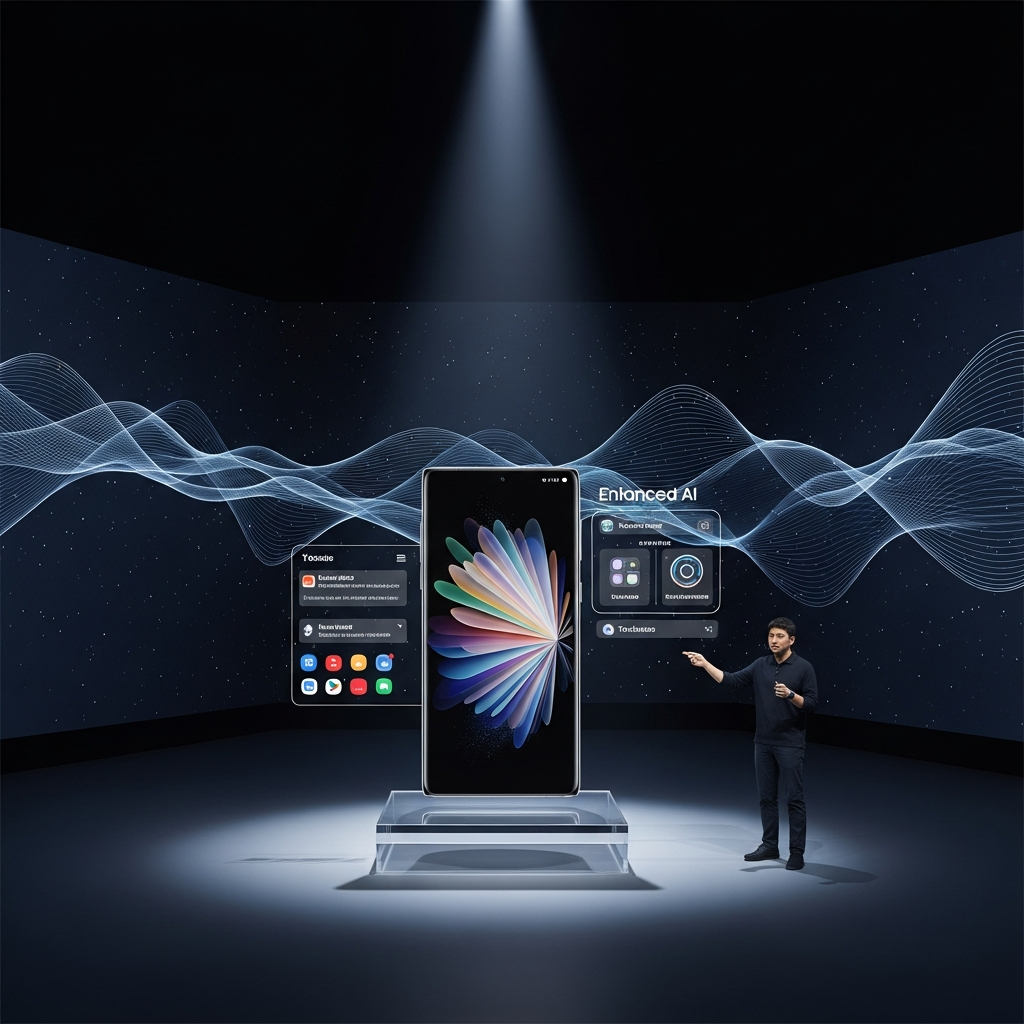
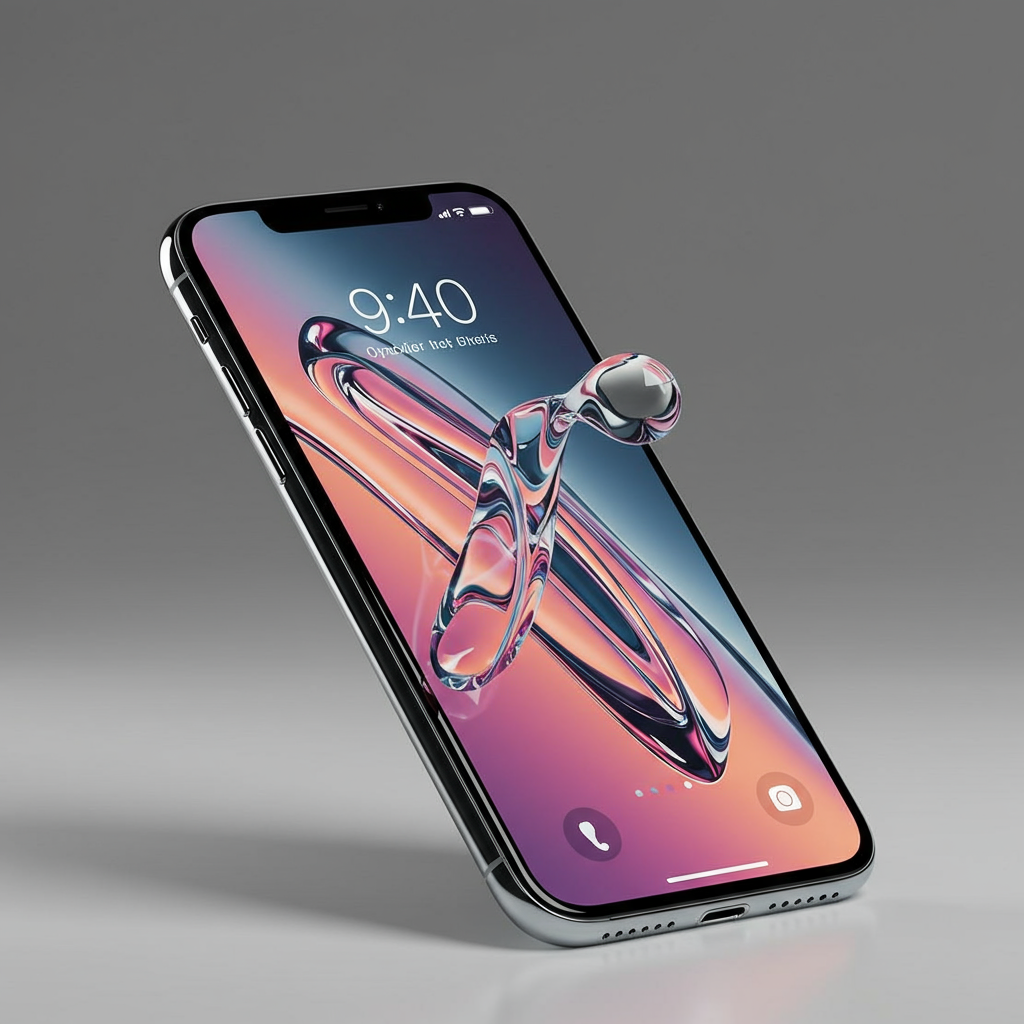
At its core, Liquid Glass introduces a fresh, more transparent, and polished look and feel to Apple’s user interfaces. Think of glassy textures, enhanced depth, and a sense of fluidity. This new design language is intended to be a unifying visual thread across the entire Apple ecosystem, from the smallest Apple Watch screen to the largest Mac display, and even the immersive environment of visionOS (which reportedly inspired the aesthetic).
Unveiled at WWDC 2025, Liquid Glass was presented as more than just a skin-deep change. It’s part of a broader strategy to make interacting with Apple devices more seamless and intuitive. The update also coincides with a change in Apple’s software naming convention, now aligning operating systems with the release year, hence iOS 26, macOS 26, and so on.
A Bold Step: Why a Redesign is Risky (and Necessary)
Overhauling the look and feel of widely used software is never a trivial matter. Users become accustomed to interface elements and workflows. Dramatic changes can lead to frustration and pushback, even if the new design is objectively better.
Learning from Past Updates
Apple itself knows this well. The redesign of the Photos app in a previous iOS version (iOS 18) faced significant criticism from many users who found the changes jarring and less intuitive than the previous interface. This history likely weighed on the minds of Apple’s design teams and leadership when considering another system-wide visual overhaul. Despite this, Apple chose to proceed, indicating the strategic importance they place on the Liquid Glass initiative. Tackling not just iOS but every major platform simultaneously was an ambitious move.
The Four Pillars of Liquid Glass Success
Based on initial reveals and analysis, the Liquid Glass design seems poised to succeed by addressing several key objectives simultaneously. These factors contribute to the perception that this design update could be a major win for Apple and its user base.
1. Fresh Aesthetic, Familiar Feel
One of the core aims of Liquid Glass is to inject a renewed sense of modernity and fun into Apple’s software while avoiding disorientation for existing users. The design offers a visually distinct look compared to prior iterations. Yet, crucial interface elements, navigation patterns, and fundamental layouts remain largely consistent with what users already know. This balance is vital. It provides that desirable “new” feel without imposing a steep learning curve, a pitfall the iOS 18 Photos app unfortunately encountered. Users can enjoy the updated visuals without relearning how to perform basic tasks.
2. Unifying the Apple Ecosystem
Apple’s tightly integrated ecosystem is one of its greatest strengths. The Liquid Glass design significantly enhances this by creating a consistent visual language across all platforms. Whether you’re using an iPhone, iPad, Mac, Apple Watch, Apple TV, or Apple Vision Pro, the core interface elements, menus, and interactive components will share the same aesthetic principles. This unification makes switching between devices feel more natural and seamless. It reinforces the idea that all these products are part of a single, cohesive experience. This consistency simplifies usability and strengthens brand identity across a growing range of devices.
3. Laying Groundwork for Future Hardware
The “Liquid Glass” name itself hints at potential future hardware directions. The transparent, fluid aesthetic seems particularly well-suited for devices that might push the boundaries of display technology. Think about rumored projects like Apple Glasses or potential future iPhones featuring entirely screen-based fronts with minimal bezels. A user interface designed with glassy transparency and organic motion could seamlessly integrate with such hardware. By implementing this design now, Apple is potentially laying the visual groundwork for interactions and aesthetics needed for its next generation of devices, ensuring a smoother transition when those products arrive.
Listening to Users: Refining Liquid Glass in Beta
While the initial concept of Liquid Glass was met with general optimism regarding its goals, the reality of implementing a transparent UI across diverse elements and user content presented challenges during early testing. Apple releases developer betas specifically to gather feedback and refine the user experience before a broad public rollout.
Early Feedback and Key Issues
Initial beta versions of iOS 26 and other platforms featuring Liquid Glass highlighted specific areas needing improvement. Some users reported issues with “app tinting,” a feature intended to add color customization, which sometimes resulted in icons appearing distorted or messy. A more significant concern arose with the increased transparency in areas like the Control Center. When overlaid on busy home screens or detailed web pages, the transparent background could make the Control Center panel itself difficult or even impossible to read. The conflicting visual information from the layer below hampered usability.
Apple’s Response in Beta 2
Apple demonstrated responsiveness to this feedback by implementing key adjustments in subsequent beta releases. Notably, iOS 26 Beta 2 included refinements to the background blur behind the Control Center. The blur effect was increased, significantly obscuring the content behind the panel. This change dramatically improved the readability of controls and information within the Control Center, addressing a major user complaint. While other areas, like notifications, also saw similar, though less dramatic, readability improvements, the Control Center adjustment signaled Apple’s commitment to refining the design based on real-world usage and feedback. These iterative changes in beta suggest the final Liquid Glass experience in the public release will be more polished and user-friendly.
Liquid Glass as Part of the Larger iOS 26 & WWDC 2025 Picture
It’s important to view Liquid Glass not in isolation, but as one piece of the extensive updates announced at WWDC 2025. The design change underpins the visual experience for numerous new features and enhancements across the ecosystem.
New Naming Convention
Alongside the design overhaul, Apple solidified a new annual naming convention for its operating systems, tying them to the release year (e.g., iOS 26, macOS 26). This simplifies version tracking and aligns the software naming with the predictable annual hardware release cycles.
Integration with Apple Intelligence
The Liquid Glass aesthetic serves as the visual layer for many of the new capabilities powered by Apple Intelligence, the company’s suite of AI features. These AI functions, ranging from on-device processing for privacy to integration with features like call screening, voicemail summaries, and enhanced search, are presented to the user through this new Liquid Glass interface. The design provides a modern backdrop for these intelligent capabilities.
Liquid Glass in CarPlay
Even standard CarPlay is receiving the Liquid Glass treatment in iOS 26. This update brings the new design language to the in-car experience, featuring refreshed app icon shapes, new colors, and potentially a dark mode option. Beyond just visuals, the iOS 26 CarPlay update significantly enhances functionality with the addition of customizable Widgets accessible from the home screen. It also introduces Live Actions, allowing users to track real-time updates (like sports scores or delivery status) directly on the CarPlay display. Crucially, it improves call and message handling, making incoming calls less disruptive with smaller pop-ups and enabling quick reaction emojis for messages directly within the interface. While standard CarPlay still doesn’t control vehicle functions like climate (that’s CarPlay Ultra), the iOS 26 update powered by Liquid Glass visuals and new features makes the standard version much more capable and visually appealing.
Broader Platform Updates
Beyond the design, iOS 26 itself brings significant enhancements like more granular Lock Screen customization, streamlined camera controls, and major improvements to communication apps including Live Translation for messages and calls. macOS 26 “Tahoe” incorporates the Liquid Glass look with features like a customizable Control Center and an integrated Phone app. iPadOS 26 sees major strides in multitasking with a revamped, more flexible windowing system closer to macOS. watchOS 26 uses Liquid Glass and integrates AI features like an AI Workout Buddy. tvOS 26 adopts the design for less intrusive playback controls and adds features like karaoke. visionOS 26 gets minor visual tweaks but adds features like customizable spatial widgets. The Liquid Glass design acts as the common visual language uniting these diverse updates.
Frequently Asked Questions
What specific visual changes does Apple’s Liquid Glass design introduce?
Apple’s Liquid Glass design brings a more transparent, glassy, and fluid visual style to its operating systems. This includes updated icons, enhanced depth effects, and standardized interface elements across devices. The aim is to give the software a fresh, modern shine while making the overall Apple ecosystem feel more unified and cohesive through a consistent aesthetic from iPhone to Mac and beyond.
What other major updates were announced alongside Liquid Glass at WWDC 2025?
WWDC 2025 introduced a range of significant updates alongside the Liquid Glass design. Key announcements included Apple Intelligence, a suite of new AI features integrated across platforms. The software naming convention shifted to reflect the year (iOS 26, macOS 26, etc.). Updates also covered enhanced CarPlay features like Widgets and Live Actions, improved multitasking on iPadOS 26, an integrated Phone app on macOS 26, AI features in watchOS 26, and new capabilities in tvOS 26 and visionOS 26.
How is Apple addressing early user concerns about the Liquid Glass design’s transparency?
Early feedback on the Liquid Glass beta highlighted issues where increased transparency, particularly in areas like the Control Center, made interface elements difficult to read when overlaid on busy backgrounds. In response, Apple released updates, such as iOS 26 Beta 2, which increased the background blur behind the Control Center. This adjustment significantly obscures the underlying content, improving the readability and usability of the panel and demonstrating Apple’s responsiveness to user feedback during the beta testing phase.
Conclusion: The Potential Impact of Liquid Glass
Apple’s Liquid Glass design is far more than a simple coat of paint. It’s a strategic visual overhaul aimed at refreshing the user experience, strengthening ecosystem unification, and preparing for future hardware innovations. While early beta feedback highlighted potential usability issues, Apple’s swift response with adjustments like the increased Control Center blur suggests they are actively refining the experience.
By balancing a fresh aesthetic with familiar interactions, Liquid Glass has the potential to land as a significant win for Apple. It provides a modern look without alienating users and builds a stronger visual identity across an ever-expanding family of devices. As iOS 26 and its companion releases roll out later this year, the true measure of its success will be in widespread user adoption and reception, but the initial strategic goals appear well on their way to being met.