Get ready for a fresh look inside your photo library. google Photos is rolling out a significant redesign focused squarely on the single photo view. This update aims to make browsing your memories simpler, more intuitive, and distinctly modern. The core goal is enhancing usability by placing key information and actions exactly where you need them most.
Google describes this revamp as bringing a “simpler, more modern, and more intuitive UI.” It’s a notable change to a central part of the app many users interact with daily. While recent updates have focused on navigation or editing, this targets the fundamental experience of looking at your pictures one by one. The redesign brings both visual tweaks and functional reorganization.
What’s New in the Google Photos Photo View?
The updated photo viewing experience introduces several distinct elements designed for quick information access and streamlined actions. You’ll notice changes from the background color to the icons you tap. These updates reshape how you interact with individual images and photo groups.
A Fresher Look: Light Mode and Glanceable Details
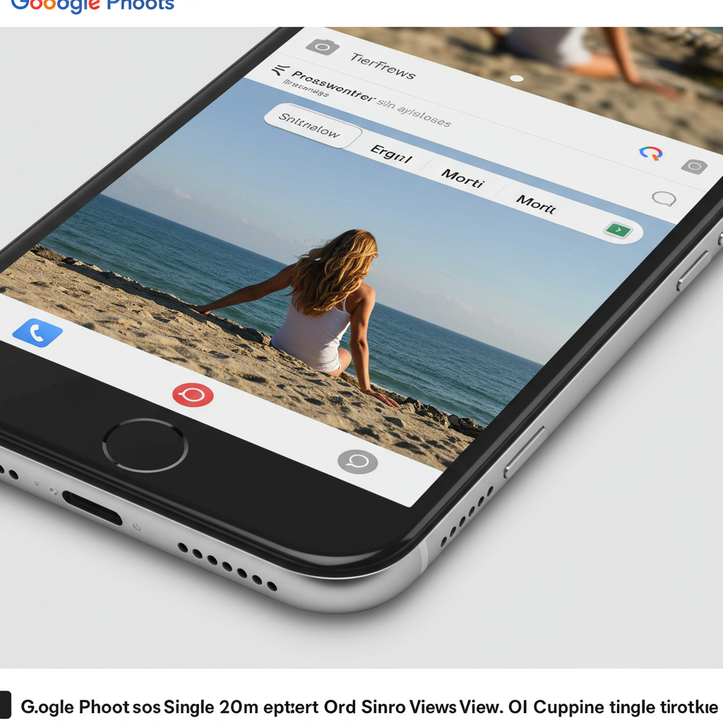
A welcome visual change is the introduction of a light mode background. Previously, the photo view often defaulted to dark. Now, the background dynamically matches your device’s system theme settings. This provides a consistent look and feel with the rest of your phone’s interface.
Crucially, important details about your photo are now immediately visible. At the very top of the screen, you’ll find “glanceable date, time, and location details.” This means you no longer need to tap into an info menu to see when and where a picture was captured. It’s all right there, simplifying quick checks of your photo’s metadata.
Quick Actions with New Badges
Below the image, you might see small, pill-shaped indicators called “badges.” These aren’t just decorative; they offer quick, context-specific actions based on the photo type or status. Tapping a badge lets you perform a relevant task without digging through menus.
Examples of actions triggered by these badges include:
Changing a photo’s category easily.
Playing or pausing a Live Photo or Motion photo instantly.
Saving a shared photo directly to your personal library.
Initiating a backup for the photo or managing its storage status.
These badges provide a convenient shortcut for frequent actions.
Streamlined Management: Photo Stacks & Bursts
Handling photo stacks and bursts also gets a dedicated treatment. When viewing these grouped photos, a new interface appears near the bottom. A new three-dot icon is specifically attached to the selected thumbnail within the stack. This menu is tailored specifically for managing the stacked images.
Options available in the stack-specific menu allow you to:
Change the top pick displayed for the stack.
Keep the currently viewed photo and delete the rest in the stack.
Remove the selected photo from the stack.
Unstack the entire group into individual photos.
Use a multi-select option to take bulk actions on several photos within the stack simultaneously.
This centralized control simplifies dealing with multiple shots taken in rapid succession.
Reorganized Bottom Bar & Overflow Menu
The actions menu at the bottom of the screen sees a significant change. The familiar Share, Edit (with a new icon), and Trash options remain untouched in this primary row. However, the Google Lens icon has been removed from this prominent spot.
Replacing Google Lens is a new “Add to” menu. This provides a streamlined way to organize the photo you’re viewing directly. Tapping “Add to” gives you quick access to actions like:
Organizing the photo into albums.
Moving the photo to your Archive.
Securing the photo in your Locked Folder.
Most other actions are now found within the main three-dot overflow menu, typically located at the top. This menu consolidates various functions including:
Accessing “About” information for the photo.
Initiating Google Lens (it’s still available, just moved).
Using “Create” options (like collages or animations).
“Cast” the photo to another device.
“Save as” for Live or Motion photos.
“Download or Delete from device” options.
The “Favorites” option seems to be located elsewhere, not within this main overflow menu or the bottom bar actions. This reorganization aims to make the most frequent actions easily accessible via “Add to” or badges, while consolidating less common options.
Why Google Made These Changes
Google states the primary motivation for this redesign is to create a more intuitive and user-friendly interface. The goal is to reduce clutter and make interacting with individual photos more efficient. By making date, time, and location “glanceable,” they save users a tap. Consolidating organizational actions into the “Add to” menu streamlines workflows for albums, archiving, and security.
Moving less frequent actions, including Google Lens, into the overflow menu simplifies the main bottom bar. While the relocation of Lens might initially feel disruptive, its functionality remains accessible. Furthermore, on Android, the system-wide Circle to Search feature provides a similar visual search capability, potentially lessening the reliance on the in-app Lens button for some users. The overall strategy is to present relevant information and actions logically.
Who Gets the Update and When?
The rollout of this photo view redesign began quietly but is now widely available on iOS devices. This means iPhone users are among the first to experience the new interface.
For Android users, the update is confirmed to be “coming soon.” However, Google has not provided a specific release date or timeline for the Android rollout. While sometimes Google updates roll out simultaneously or start on Android first, this particular design refresh is hitting iPhones ahead of Android devices. Users on Android will need to wait a bit longer to see these changes appear in their Google Photos app.
Impact and User Experience
This redesign brings a cleaner aesthetic to the photo view. The inclusion of a light mode makes the app feel more integrated with system themes. Making core photo details immediately visible saves time and effort. The introduction of dedicated badges for quick actions and streamlined stack management should make common tasks faster.
However, any significant UI change can require a brief adjustment period. Users accustomed to the old layout will need to learn where Google Lens and other options have moved. The new “Add to” menu and the location of actions within the main three-dot menu represent the biggest navigational shifts. Once users adapt, the consolidated and context-aware actions are intended to improve overall usability and make photo management within the app more efficient. This update fits into a pattern of ongoing improvements Google is making across the Photos app, from editing to AI-powered search.
Frequently Asked Questions
How does the new Google Photos photo view improve organization?
The redesign enhances organization mainly through the new “Add to” menu in the bottom bar and context-aware badges. The “Add to” menu provides quick access to essential organizational tasks like adding photos to albums, moving them to the archive, or placing them in the locked folder, consolidating these actions in one place. Badges appearing on photos offer one-tap actions for specific management tasks, such as changing a photo’s category or saving shared images directly to your library.
Where can I find Google Lens after the redesign?
With the photo view redesign, Google Lens has been moved from its previous location in the bottom action bar. You can now find Google Lens functionality within the main three-dot overflow menu, typically located at the top of the screen when viewing a single photo. This menu contains various actions including “About,” “Create,” and “Cast.” On Android devices, the Circle to Search feature also offers similar visual search capabilities system-wide.
When can Android users expect this Google Photos photo view update?
The photo view redesign is currently widely rolled out for users on Google Photos for iOS. Google has stated that the update is “coming soon” to the Google Photos app for Android. However, they have not provided a specific release date or timeline for when Android users will receive these new features and UI changes.
This photo view redesign represents a thoughtful update aiming to make Google Photos more intuitive and efficient for everyday use. By making essential information immediately visible and streamlining key actions, Google is refining the core experience of reliving and managing your photo library. While iOS users are enjoying it now, the update promises a cleaner and more usable experience for Android users too, whenever it arrives. The changes are part of a broader effort to enhance the Google Photos platform continuously.
Word Count Check: 1048