Apple Adjusts WWDC 2025 Designs Based on User Feedback
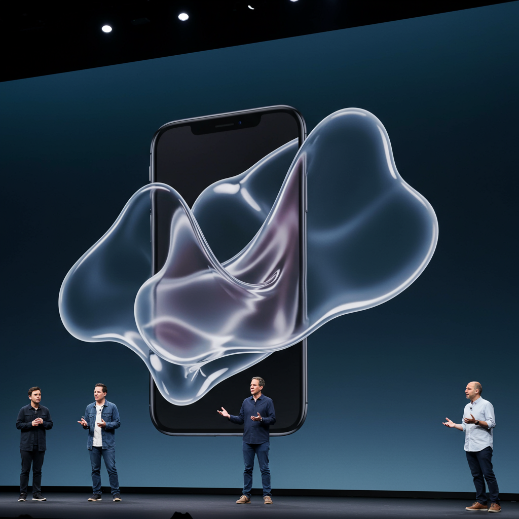
During its Worldwide Developer Conference (WWDC) 2025, Apple unveiled a sweeping design overhaul for its upcoming operating systems, including iOS 26 and macOS Tahoe 26. A central element of this update was the new “Liquid Glass” aesthetic, described by Apple as a fluid, translucent material designed to enhance user interface elements across platforms like iPhone, iPad, Mac, Apple Watch, and Apple TV. However, the initial developer betas introducing these changes quickly stirred debate and criticism online.
Now, it appears Apple is already making adjustments to some of the more controversial visual revisions based on early user reaction. Reports indicate that recent developer beta releases have modified the appearance of the Liquid Glass effect, particularly within the Control Center, and reverted a significant change to the iconic Finder app icon on macOS.
The Divisive ‘Liquid Glass’ Appearance
The introduction of Liquid Glass aimed to bring dynamic transparency and reflectivity to UI elements, creating a modern, unified look inspired by visionOS. Apple touted it as its “broadest software design update ever,” designed to adapt based on content and context.
Despite the ambitious vision, feedback from early beta testers highlighted practical concerns. Many users found the intense transparency, especially when interacting with the Control Center, made elements hard to read. The background would show through too clearly, making icons and text less distinct and leading to complaints that the design prioritized aesthetics over functionality. Discussions across social media, including platforms like Reddit and X, saw users voice frustration over readability issues with notifications and overall visual clutter.
In response to this feedback, Apple has made a notable change in the second developer beta of iOS 26. The background behind the Control Center now features increased darkness and a stronger blur effect. This adjustment is intended to make the foreground elements, which retain the glassy appearance, stand out more clearly against the background, significantly improving the viewing experience compared to the initial beta. While some users still debated whether this updated blur was ideal or if the original beta was simply a matter of adaptation, the move clearly addresses the primary readability complaint.
Reverting the Finder Icon Flip
Another visual change that drew immediate and widespread negative reaction was the alteration of the Finder app icon in macOS Tahoe. The initial developer beta flipped the traditional colors of the Finder face, placing the blue side on the right and the white side on the left. This seemingly small detail reversed a design convention that has been consistent on the Mac for decades, maintaining a lighter shade on the right and a darker color on the left through numerous past design updates.
The reversal of this long-standing visual identity was met with disapproval from Mac users who felt it was an unnecessary and jarring departure from tradition. The strong negative feedback online appears to have prompted Apple to reconsider. In a subsequent developer beta, the Finder icon has been reverted to its classic color layout, restoring the familiar blue-on-left, white-on-right configuration.
These swift adjustments in the developer betas demonstrate Apple’s responsiveness to user feedback, even to relatively minor design points that spark significant community reaction. While introducing bold new visual directions like Liquid Glass, the company shows a willingness to iterate and refine based on how users interact with and perceive the changes in the real world. As the betas progress towards a final release expected this fall, further refinements are always possible.