
Understanding the monthly rhythm of the U.S. labor market can feel like interpreting two different languages. While official figures from the Bureau of Labor Statistics (BLS) are closely watched, the private sector report from ADP often offers an early peek. However, in June, these two key indicators presented a starkly different picture, revealing a significant divergence that economists are now analyzing closely. This split between the government‘s comprehensive nonfarm payrolls data and ADP’s private employment figures highlights potential nuances within the job market recovery.
The latest reports underscore a crucial point: relying on a single headline number can be misleading. Comparing the BLS and ADP data side-by-side for June shows not just a difference in the total number of jobs added or lost, but also a complete disagreement on the direction of travel for employment during the month. This unexpected contrast warrants a deeper look into what each report measures and why such a significant gap appeared this time.
Understanding the June Jobs Reports: BLS vs. ADP
Two primary reports offer insights into U.S. employment trends each month. The first is the Employment Situation report from the Bureau of Labor Statistics (BLS), a division of the U.S. Department of Labor. This official report, often called the nonfarm payrolls report, is based on two comprehensive surveys: one of approximately 122,000 businesses and government agencies, and another of about 60,000 households. It provides a broad view of employment across most sectors of the economy, crucially including government jobs. The BLS report is widely considered the benchmark for the health of the national labor market and is a key data point for policymakers, including the Federal Reserve.
Conversely, the ADP National Employment Report, produced by the private payroll processing firm ADP in collaboration with researchers, focuses exclusively on private-sector employment. It measures the change in total nonfarm private employment based on data from ADP’s vast client base of U.S. businesses. While it provides a timely look at private hiring trends, it does not include government workers, which can sometimes lead to differences compared to the BLS figures, especially in months where government hiring or firing is significant.
What Each Report Measures
The core difference lies in their scope. The BLS Nonfarm Payrolls figure counts jobs across almost all non-agricultural sectors in the U.S., encompassing private companies, state and local governments, and the federal government. It’s a wide-angle lens on total job creation or loss in the economy.
The ADP National Employment Report offers a more focused view, counting jobs only within the private sector. It specifically excludes all government employment, whether federal, state, or local. Think of it as looking only at jobs created or lost by businesses, from small startups to large corporations.
The Shocking Numbers from June
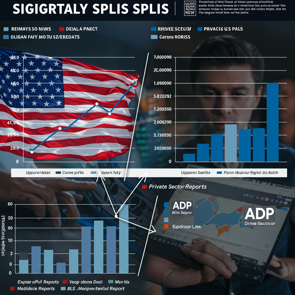
The June data delivered a significant surprise due to the large disparity between these two measures. According to the official BLS report, the U.S. economy added a total of 147,000 nonfarm jobs during the month. This figure was notably higher than the 110,000 jobs economists had generally forecast. The same BLS report also showed positive movement in the unemployment rate, which decreased to 4.1% from 4.2% the previous month, defying predictions that it might tick up to 4.3%.
In stark contrast, the ADP report for June painted a very different picture for the private sector. The report indicated a decrease of 33,000 private sector jobs. This wasn’t just a smaller gain than the BLS reported; it was a net loss of jobs within the segment ADP tracks. The divergence was striking: a positive gain reported by the government versus a negative loss reported by a major private processor.
Unpacking the Divergence: The Role of Government Hiring
How could two reports on the same labor market in the same month show such wildly different results? A close examination of the details within the BLS report provides a significant part of the answer. While the headline nonfarm payroll gain was 147,000, a large portion of this growth came from government employment.
Specifically, the BLS data showed that government jobs rose by a substantial 73,000 in June. This single category accounted for roughly half of the total nonfarm payroll increase reported by the BLS. Since the ADP report only measures private payrolls and excludes government workers entirely, it did not capture this significant source of job growth.
Why Government Jobs Matter
Government hiring includes positions at the federal level, but often sees larger swings in state and local government employment, such as in public education or administrative roles. These jobs contribute to the overall employment level in the country and are part of the BLS’s comprehensive count. The fact that government hiring contributed nearly half of the total BLS gain in June is critical to understanding the gap with the ADP data, which saw a decline in only private jobs.
While the substantial increase in government employment explains a large part of the numerical difference, it also points to a potential underlying trend. If job growth is heavily reliant on public sector hiring while the private sector shows weakness or contraction, it could signal different conditions across the economy.
What This Split Reveals About the US Labor Market
The significant divergence between the BLS and ADP reports in June isn’t necessarily a statistical error as much as it is a reflection of different slices of the labor market behaving differently. The official data suggests overall employment continued to grow, exceeding expectations, driven partly by the public sector. The private data suggests softening or decline within businesses.
This situation echoes observations by economists. As noted by Cory Stahle at the Indeed Hiring Lab, while the headline BLS numbers (job gains and lower unemployment) look positive overall, the reality for many job seekers might be different. Stahle points out that gains might feel less impactful “for job seekers outside of healthcare & social assistance, local government, and public education.” This suggests that the strength seen in the BLS numbers might be concentrated in specific sectors, including the government and areas like healthcare, while other private industries could be experiencing stagnation or even job losses as indicated by ADP.
A Potential “Schism” in Employment Gains
The divergence, amplified by the role of government hiring, could indicate a growing “schism” or split within the U.S. labor market. Instead of broad-based job creation happening uniformly across all sectors, growth appears to be more concentrated. Areas like healthcare and social assistance, along with local government and public education, seem to be robust sources of employment. Meanwhile, other private sectors, captured solely by the ADP data, might be facing headwinds leading to reduced hiring or job cuts.
This kind of segmented growth means the headline unemployment rate or total job gain might not fully reflect the job search experience or employment conditions for workers in all parts of the economy. It highlights the importance of looking at the detailed breakdowns within the BLS report, beyond just the headline number, to understand where job growth is occurring and where it is not.
Why These Reports are Important
Both the BLS and ADP reports serve as vital indicators of the U.S. economic climate. Employment figures are a key metric for gauging economic health, consumer confidence, and potential inflation pressures. Businesses use this data to inform hiring and investment decisions. Policymakers, especially the Federal Reserve, rely heavily on these reports to assess the state of the labor market and guide monetary policy decisions, such as interest rate adjustments.
While the BLS report is considered the more comprehensive and official measure, the ADP report often comes out first and provides an early look, though its methodology and scope differences mean it doesn’t always perfectly predict the BLS outcome. Significant divergences, like the one seen in June, prompt closer scrutiny and a deeper dive into the underlying data to understand the true dynamics at play in the complex U.S. labor market.
Frequently Asked Questions
What is the difference between the BLS and ADP jobs reports?
The primary difference lies in their scope. The BLS (Bureau of Labor Statistics) report measures total nonfarm employment across most U.S. sectors, including government and private businesses, based on extensive surveys. The ADP report, conversely, counts only private-sector jobs using data from its payroll processing clients, specifically excluding all government employment. This difference in coverage is a key reason why their numbers can diverge.
Why did the BLS and ADP jobs reports diverge so much in June?
The significant divergence in June was largely due to a substantial increase in government hiring, which the BLS reported but the ADP report (which only tracks private payrolls) did not capture. The BLS showed a gain of 147,000 nonfarm jobs, with government contributing 73,000 of those. The ADP report, focusing solely on private jobs, showed a loss of 33,000. The exclusion of government jobs from the ADP data was a major factor in this particular month’s large split.
What does the divergence between the BLS and ADP reports mean for the US economy?
The divergence suggests that job growth might not be uniform across all sectors of the U.S. economy. While the overall BLS number indicates continued hiring momentum, partly fueled by the public sector and specific private industries like healthcare, the ADP data hints at potential weakness or contraction in other parts of the private sector. This could mean the labor market is experiencing a “schism,” where job opportunities are strong in certain areas but limited or declining elsewhere, impacting the overall perception of economic health for different groups of workers.