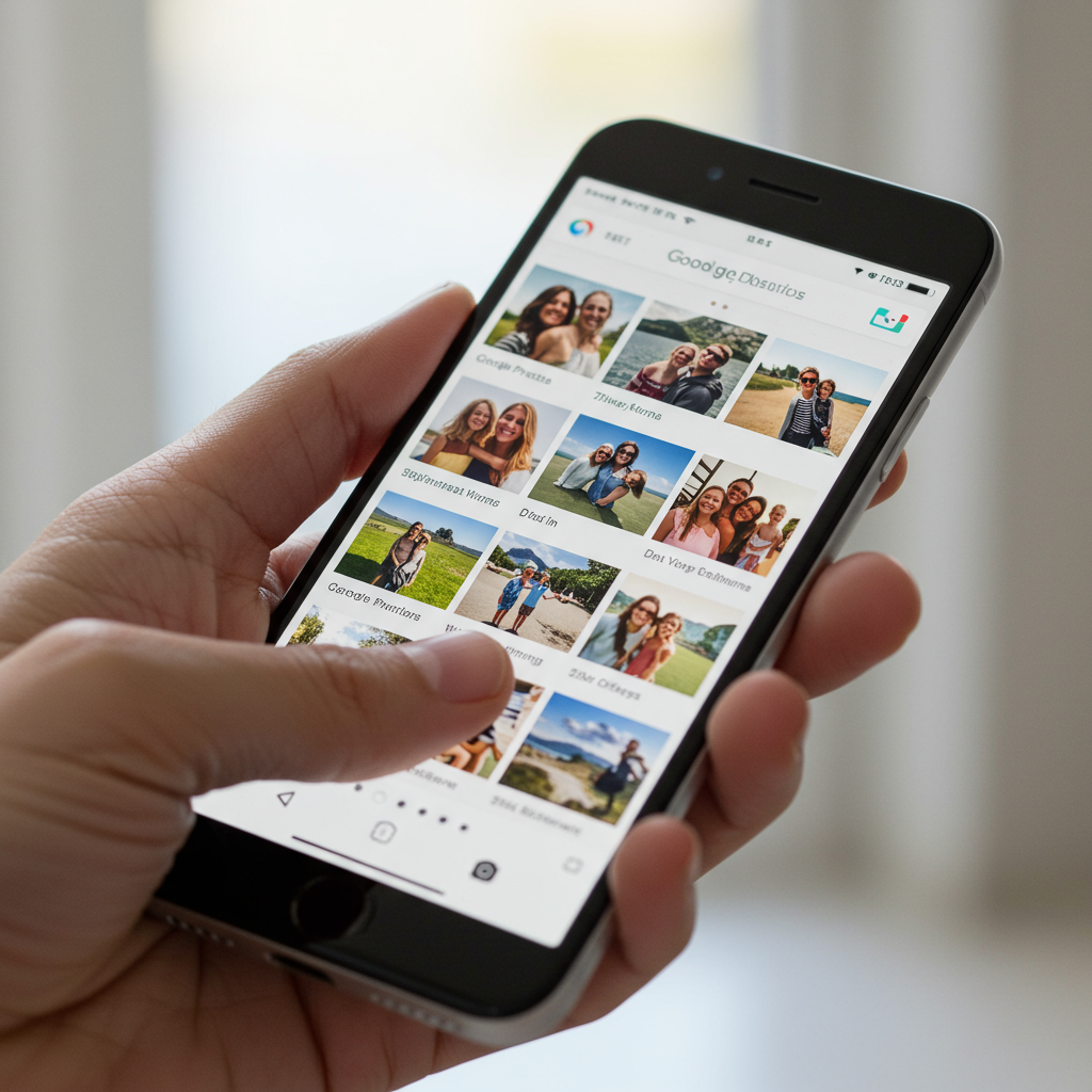
google photos is rolling out a major redesign specifically focused on how you view your cherished memories. This significant update introduces several changes designed to streamline the user experience and put information front and center. Initially launching on iOS devices, Google has confirmed these enhancements will arrive on Android “soon.” Get ready for a fresh perspective on browsing your photo library within the app.
Diving Deep into the New Photo viewing Experience
This isn’t just a minor tweak; Google describes this update as a substantial overhaul of the photo viewing interface. While the app’s overall navigation has seen adjustments in recent years, the core viewing screen remained largely untouched until now. The goal appears to be enhancing usability and making key details instantly accessible while consolidating less frequent actions.
A Fresh Look: Light & Dark Mode Matching
One immediate visual change is the introduction of a brand-new light mode specifically for viewing photos. The app will now automatically match your device’s system-wide light or dark mode preferences. This ensures a consistent and comfortable viewing experience across your device. Whether you prefer bright interfaces or darker themes, Google Photos adapts.
Info at a Glance: Date, Time, and Location
Remember squinting to find when or where a picture was taken? The redesign makes this much easier. Date, time, and location details are now displayed prominently at the very top of your photos. This “glanceable” information allows you to quickly pinpoint the context of your memories without needing to dive into details menus. Location information will only appear if it was captured when the photo was taken.
Streamlined Actions: The Evolving 3-Dot Menu
A key aspect of this update is the reorganization of actions. Many actions that might have been more scattered are now consolidated. The three-dot menu, a familiar interface element, plays a central role in this streamlining. Google notes that all previous functionality is still available; it just might have moved its location.
The primary 3-dot menu, usually found in the top right corner, now includes several consolidated actions. Tapping this menu reveals options like About the photo, integration with Google Lens, tools to Create something from the photo (like collages or animations), the ability to Cast the photo to another screen, a Save as option specifically for Live or Motion photos, and controls to Download or Delete the image from your device.
Contextual Controls: Photo Stacks and Bursts
Handling photo stacks or bursts is also getting a dedicated touch. You may now see a new, smaller three-dot menu attached specifically to these grouped items. This menu provides controls tailored to managing stacks and bursts. Options here can include Unstack the group, removing individual photos from the burst, changing the photo shown at the top of the stack, and a multi-select option for easier management within the stack.
New Navigation Helper: The ‘Add to’ Button
Look towards the bottom of the photo viewing screen for another new addition. A new “Add to” button is appearing in the bottom bar. This button serves as an additional avenue for users to take various actions on the selected photo. It offers another path for common tasks, supplementing the streamlined 3-dot menu.
Visual Cues: Understanding New Photo Badges
The redesign also introduces new visual “badges” that can show up near a photo. These small icons provide quick indicators or direct actions right from the viewing screen. Examples include:
A play/pause button on a Motion or Live photo.
Badges allowing you to change the photo’s category.
An option to save a shared photo directly to your library.
Controls related to backing up a photo or managing storage.
These badges aim to make frequent actions more immediately accessible without needing to open a menu.
Broader Context: Google Photos’ Ongoing Evolution
This viewing interface update is part of a larger, ongoing effort by Google to refine and modernize the Google Photos application. Over the past year, the app has seen a series of changes aimed at cleaning up the user interface and improving navigation across its various sections.
The Year-Long Redesign Journey
Google has been steadily working to streamline Google Photos. This includes structural changes across the app’s main tabs. The goal is to make the app feel more intuitive and less cluttered, especially as users store vast amounts of photos and videos.
Changes Across Tabs: Photos, Collections, and Search
Beyond the viewing screen, other parts of the app have been updated. The main Photos tab now offers better auto-grouping with features like “Stacks” and provides users more control over content from other apps, allowing them to hide clutter. New “Photos” view settings offer layout options and preferences for showing backed-up content.
The Collections tab has replaced the older “Library.” This shift moves away from a simple reverse chronological list of albums towards high-level groupings like People & pets, On this device, Albums, Documents, Places, and Moments. While this might add a tap to access local folders compared to the old carousel, it organizes content into more meaningful categories.
The Search tab has also been simplified, focusing more on using text queries to find content.
The Rise of AI: Gemini and Ask Photos
Artificial intelligence is playing a significant role in Google Photos’ evolution. The app already includes the “Ask Photos” AI search tool, which allows users to find photos using natural language within the app. Building on this, Google has announced deeper integration with the Gemini app on Android. This allows users to search their Google Photos library directly from within the Gemini app using conversational prompts. Users can filter photos based on saved faces, locations, dates, descriptions of content, and even the context of their conversation with Gemini. Google is also testing a “Personalized” AI model for even better integration.
Anniversaries and Editors: May 2025 Updates
Just prior to this viewing redesign, Google Photos celebrated its 10th anniversary in May 2025 with its own set of updates. A major focus was a substantial overhaul of the photo editor. The redesigned editor features a more streamlined look, aligning with Google’s new Material 3 Expressive design language. All editing tools are gathered in one place, and new AI suggestions offer one-tap enhancements combining multiple effects. Google also expanded access to powerful AI features previously limited to Pixel devices, such as Auto Frame and Reimagine.
Google used the anniversary to highlight the app’s scale, noting over 1.5 billion monthly users and more than 9 trillion photos and videos stored. Monthly activity includes hundreds of millions of searches, memories shared, and photos edited.
Web Gets Dark Mode Too
Completing the Dark Mode rollout across platforms, Google recently added Dark Mode to the web version of Google Photos at photos.google.com. Users can now enjoy a darker interface on their desktop or laptop browsers, matching their preferences or system settings.
What’s Next? Speculation on Future Changes
While the current viewing redesign is a major focus, Google continues to explore further improvements. Reports suggest that future changes could include an even more significant interface overhaul, potentially replacing traditional tabs with a floating search bar. These rumors indicate Google’s ongoing commitment to refining the user experience and making photo library navigation smoother.
Why This Matters: Impact on User Experience and Management
These changes represent a significant shift in how users interact with Google Photos at the most granular level – viewing individual pictures. The primary goal is to make the experience more efficient and intuitive. By placing glanceable information upfront and consolidating actions, Google aims to reduce friction and speed up common tasks.
However, any major interface change can require an adjustment period for users. Features they were used to finding in one spot are now moved, primarily into the 3-dot menus or the new ‘Add to’ button. While all functionality remains, users may need a little time to explore and re-learn the new layout.
This update also ties into Google’s broader strategy of leveraging AI for photo management. By cleaning up the viewing interface and improving navigation elsewhere in the app, Google is potentially paving the way for AI features like “Ask Photos” and Gemini integration to become even more central to the user experience. The combined efforts aim to provide powerful tools for organizing, finding, and enhancing the ever-growing number of photos and videos users store.
Frequently Asked Questions
What are the main visual changes in the Google Photos viewing redesign?
The core visual changes focus on bringing key information forward and streamlining actions. This includes a new automatic light or dark mode matching your device’s settings, displaying the date, time, and location directly at the top of the photo, and consolidating many actions into a streamlined three-dot menu. New badges and a bottom “Add to” button also appear for specific actions and information.
Where can I find photo actions like ‘Download’ or ‘Google Lens’ after the update?
With the redesign, many actions like Google Lens, Create options, Cast, Save as, Download, and Delete are now primarily found within the three-dot menu located in the top right corner while you are viewing an individual photo. Additional context-specific menus may appear for things like photo stacks or bursts, and a new ‘Add to’ button in the bottom bar offers another path for various actions.
When will the new Google Photos viewing redesign be available on Android devices?
The significant redesign of the photo viewing experience in Google Photos is currently rolling out first to users on iOS devices. Google has officially stated that this update will be coming to Android devices “soon.” An exact date has not been provided, but Android users can expect to see these changes in a future app update.
Conclusion
The latest Google Photos update marks a significant evolution in the app’s core photo viewing experience. By making crucial information like date and location instantly visible and consolidating actions into streamlined menus and new buttons, Google aims to enhance usability and navigation. Rolling out first to iOS with an Android release promised soon, this redesign is part of a larger trend within Google Photos to modernize its interface, integrate powerful AI search capabilities via features like Ask Photos and Gemini, and build upon recent improvements like the revamped editor and expanded AI tools. While users may need a moment to adapt to the new layout, the changes represent a strategic move towards a more intuitive and powerful photo management platform.